Email newsletter redesign.
Modernizing a legacy newsletter.
-
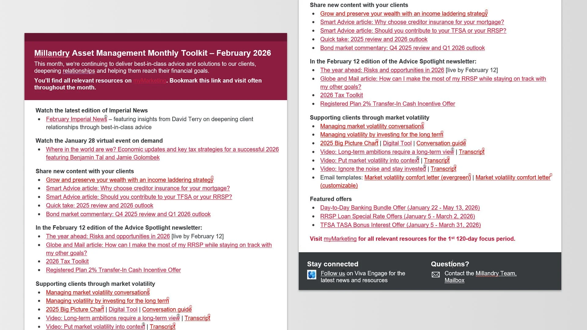
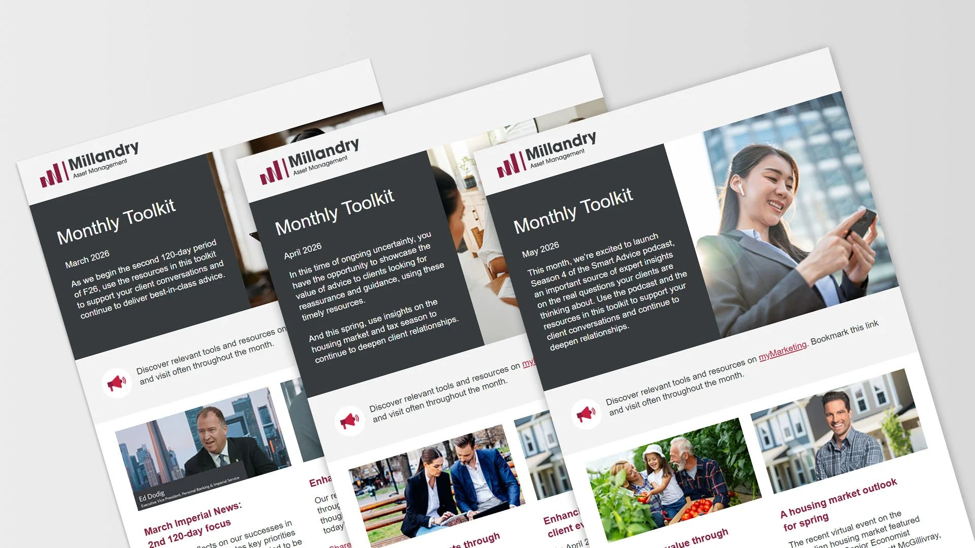
Before
A content-heavy internal newsletter with limited visual structure, and information that is difficult to scan.
-
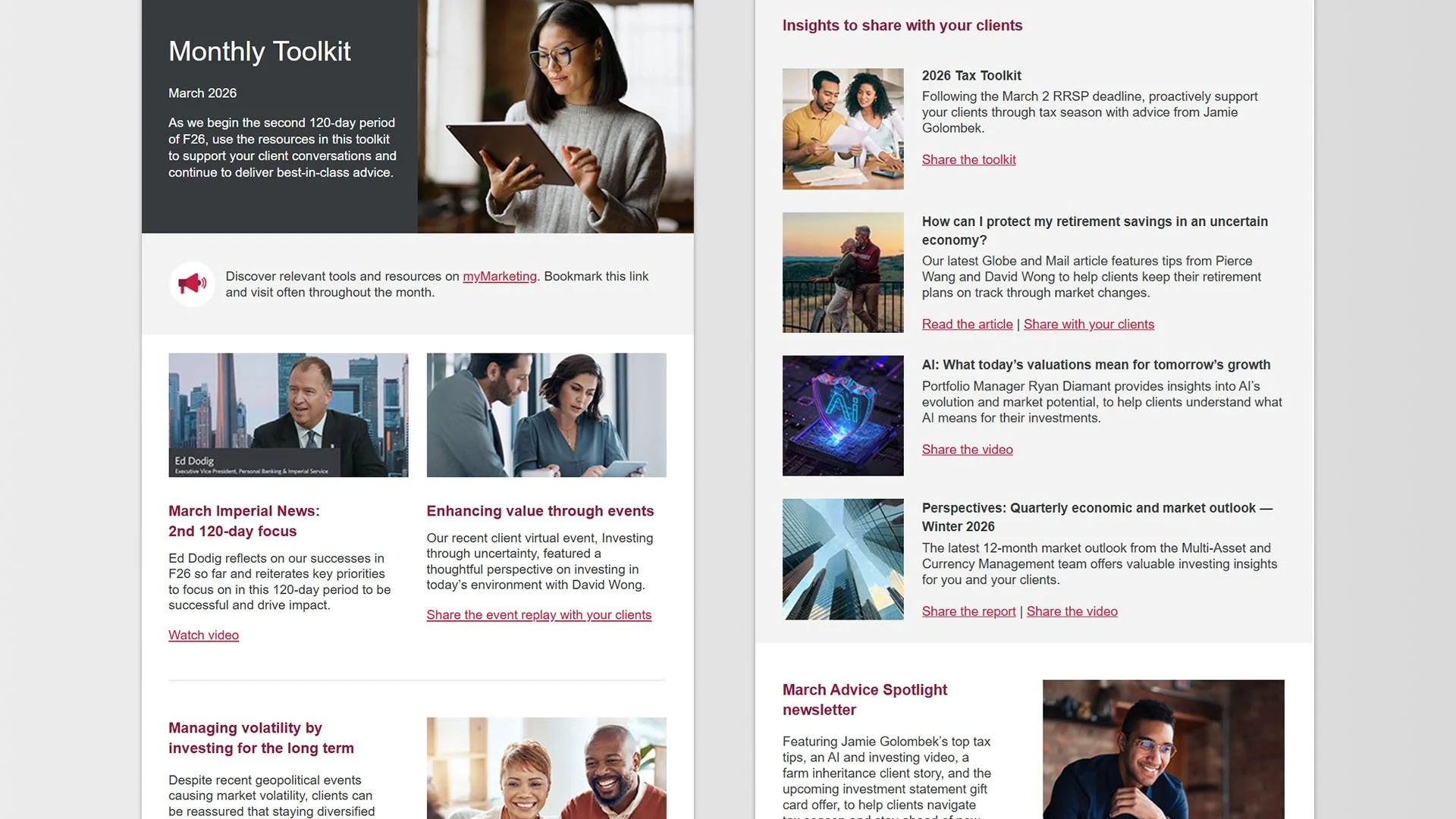
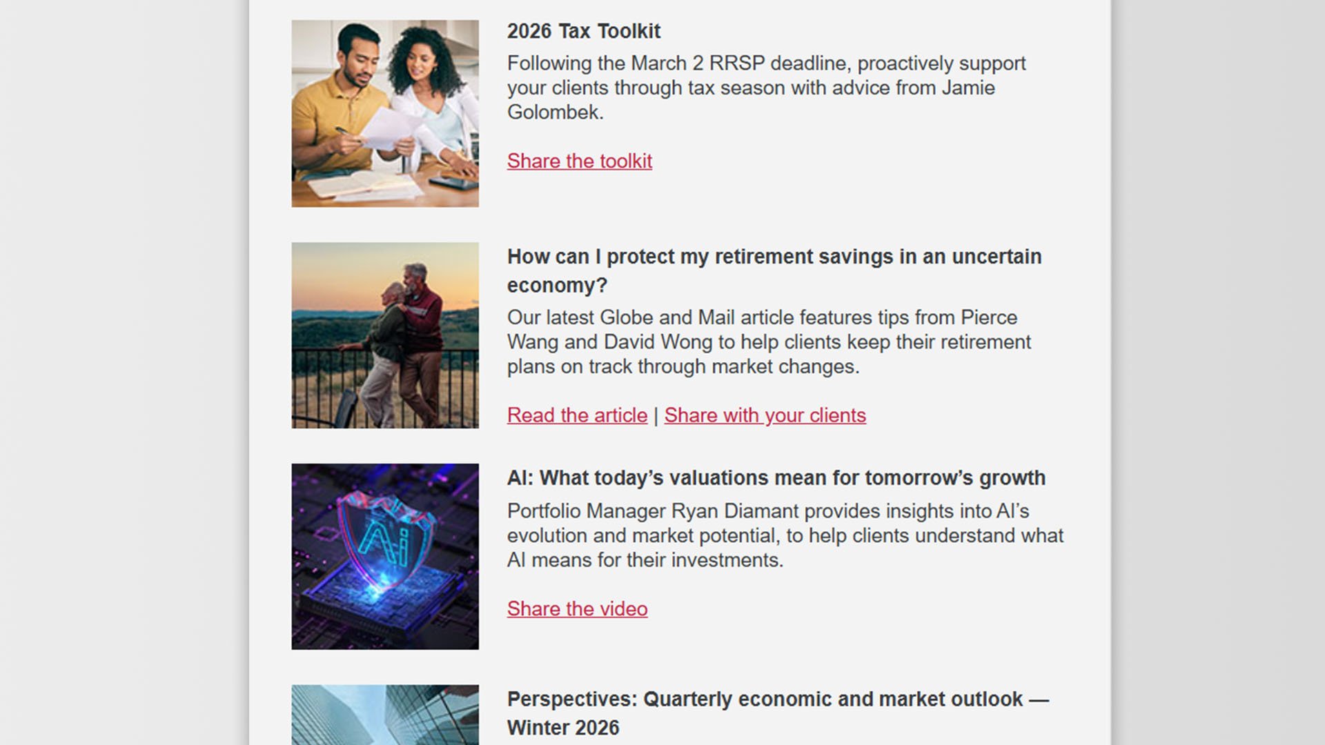
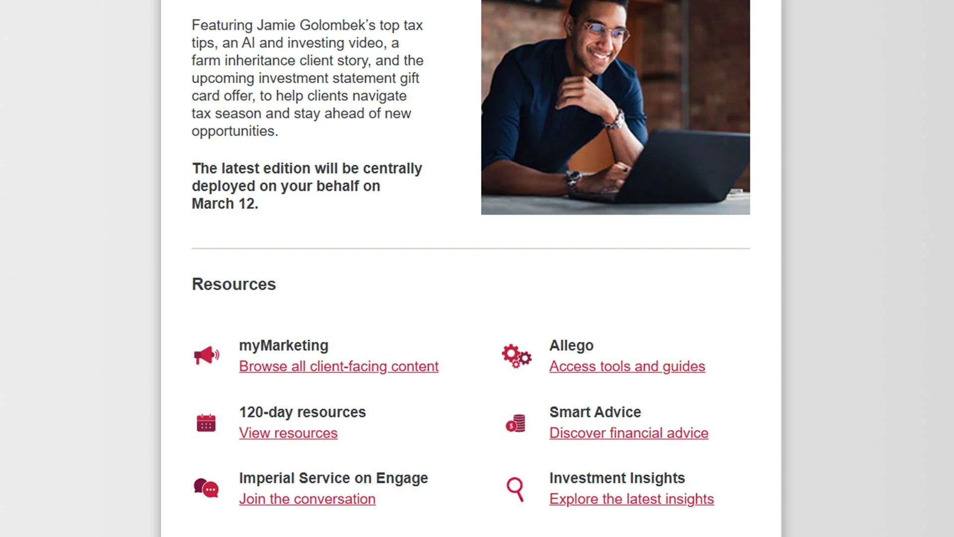
After
The redesigned email newsletter template with enhanced structure, readability, brand alignment, and accessibility.
Project overview.
The monthly toolkit newsletter was redesigned to make an outdated internal update more engaging, accessible, and visually consistent. It fixed poor hierarchy, inconsistent branding, and rigid layouts by adding a modern banner system, clearer typography, streamlined content organization, and a scalable monthly template. Accessibility improvements, including better contrast and spacing, enhanced readability across devices.
Client: Canadian Financial Institution*
Year: 2026
Skills demonstrated: HTML coding for Microsoft Outlook, workflow optimization, template system design, accessibility
Tools: Adobe Dreamweaver (template coding and development), Microsoft Outlook (end-user template access and customization)
*Client name has been modified for portfolio presentation.
Project goals.
-
Improve visual hierarchy
Create a clear content hierarchy using improved typography, spacing, and layout structure to support faster scanning and readability.
-
Enhance accessibility
Improve accessibility with stronger colour contrast, scalable typography and line spacing, descriptive alt text, meaningful link text, and semantic structure.
-
Scalable template system
Create a flexible, modular template system to streamline monthly production, ensure lasting brand consistency, and enhance accessibility compliance.
The challenge.
Coding email newsletters for Microsoft Outlook presents distinct HTML challenges.
Outlook’s rendering engine relies on Microsoft Word, which limits CSS support and breaks modern layout techniques, making tables and inline styles necessary
Inconsistent support for media queries and web fonts complicates responsive and accessible design
Attention to accessibility requires stronger colour contrast, scalable typography/generous line spacing, descriptive alt text for images, meaningful link text, and clear semantic structure (headings and lists) to ensure content reads correctly in screen readers and across varied Outlook clients
Projected impact.
Faster scanning of key monthly updates
Improve employee engagement by 15-25%
Increase accessibility compliance
Reduce production time by 30-45%
Implementation highlights.
-
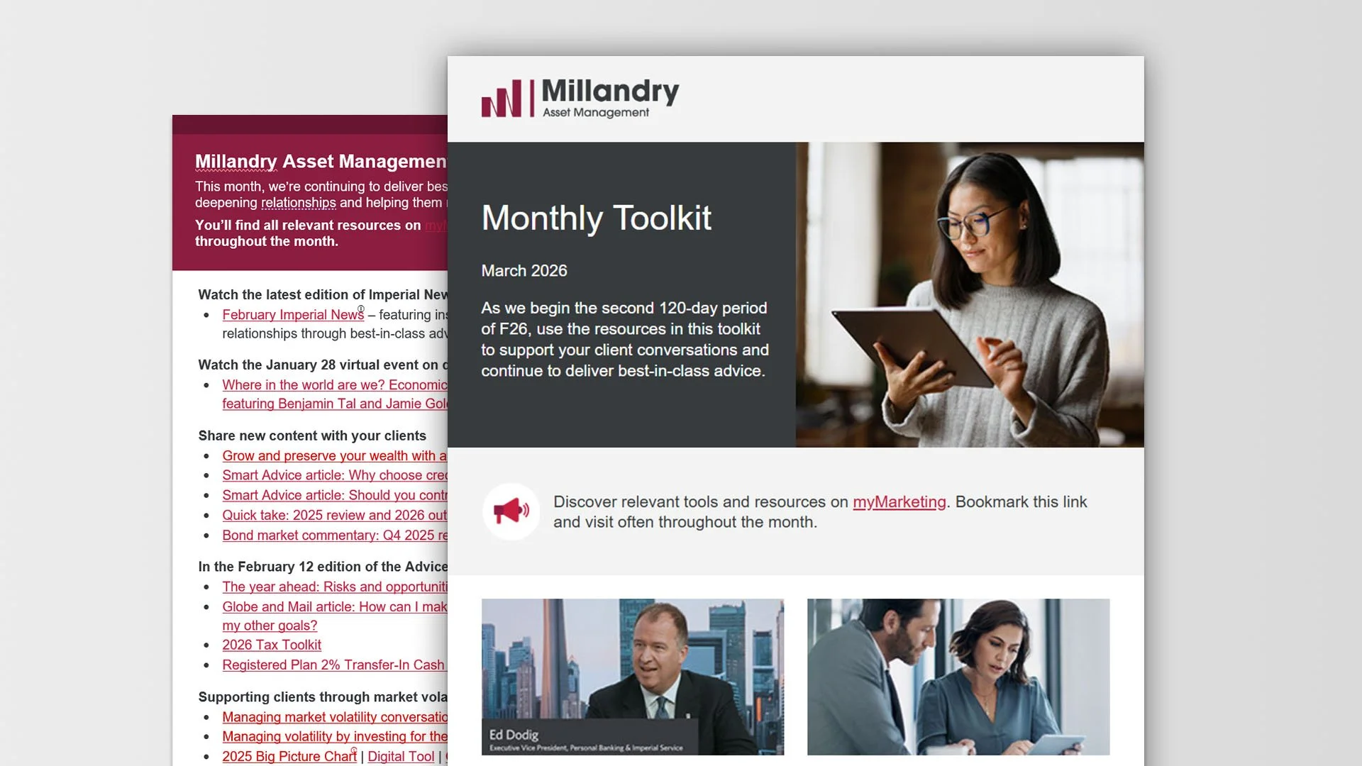
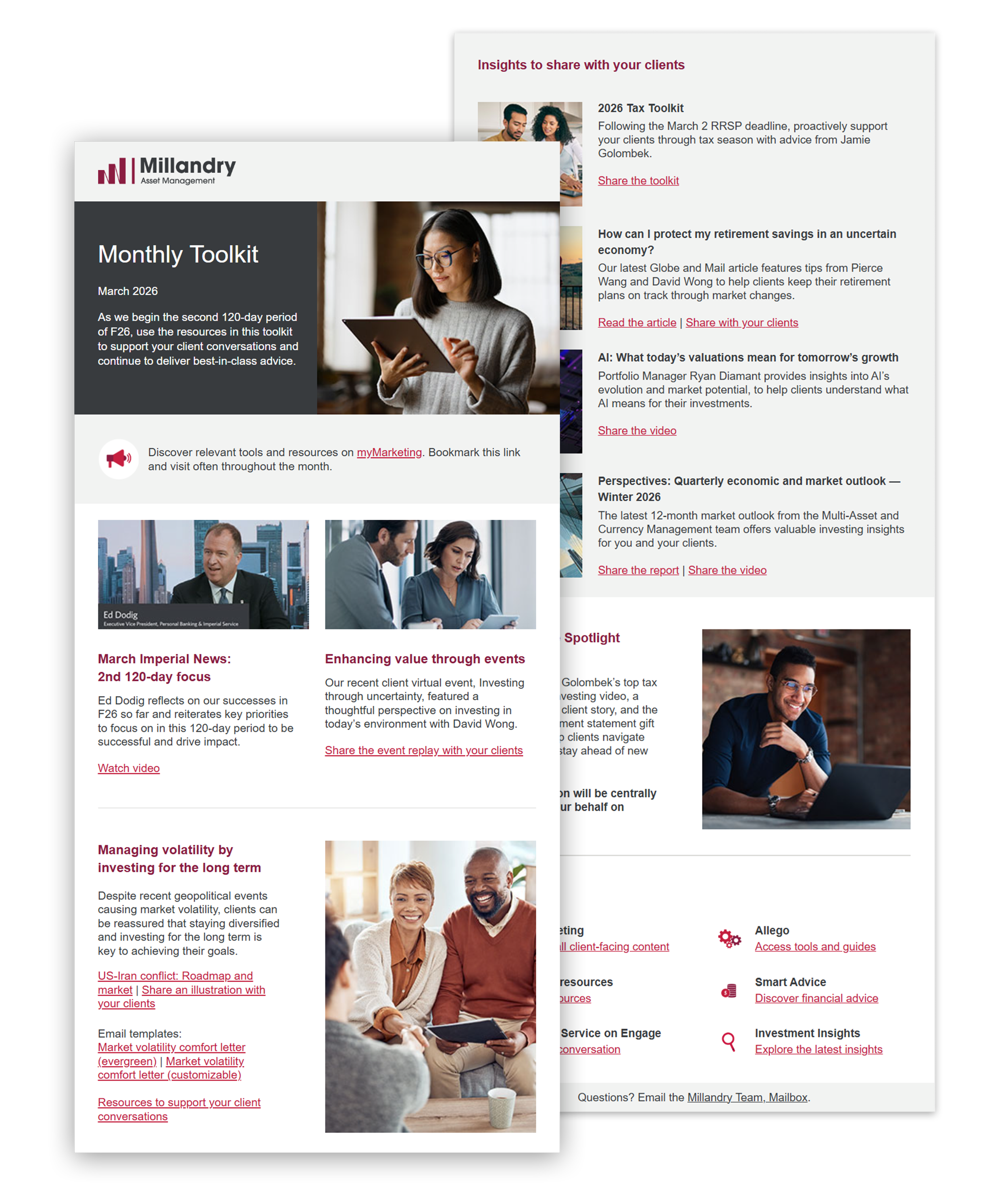
Layout and content organization
Introduced a consistent two-column layout with clear content hierarchy, aligned imagery and text, and standardized spacing and alignment to improve readability, visual balance, faster scanning, and overall clarity and consistency across sections.
-
Typography and accessibility
Normalized link styles across the template using structured code to prevent Outlook auto-formatting, improved font size and line height for accessibility, refined colour contrast between background tones and text, reduced structural issues flagged by accessibility tools, and enhanced readability and hierarchy.
Results.
This wasn’t just a visual refresh – it was a structural optimization. By aligning design decisions with the realities of email clients like Microsoft Outlook, I transformed a fragile template into a reliable, scalable communication system.
Outcome and impact.
Within 3 months of implementation:
35% reduction in production time through a reusable, standardized template system and simplified build process.
26% increase in employee engagement with key newsletter content, driven by improved hierarchy and readability.
The redesigned monthly toolkit newsletter created a more accessible, scalable, and visually engaging communication experience while improving production efficiency and maintaining brand consistency.
Next step?
View more work or reach out to discuss how I can support your business or marketing team with scalable design systems and marketing materials.